Log #34: April/10/2025
- Inspiring Playtest
- Flexible Forms
- Signage Pain
- We're all gonna die!!!
A visitor was watching over us this week, and I decided to ask them to playtest our game. They had no experience with computer games so I had to teach them WASD Mouse movement, but they enjoyed the vibe of our game. We got positive feedback, and I was really surprised by how much the awkward office resonated with them. This gives me confidence in our game going forward.

Going to the boss' office. Some of my signage pain is above.
And while I have new confidence, my fears of running out of time are realizing. There is much to be done, and my window to tell a "cool" story is slipping away. I feel as if I have been lazy these past months, and I fear our project will be shallow because of it. Of course one solution is to work hard on our game, but my procrastination still eats at me.
To continue the drama: my self-proclaimed mediocrity scares me, and I think our ERASE project will be mid.
Perhaps I should be less judgemental. I also want to act less scared.


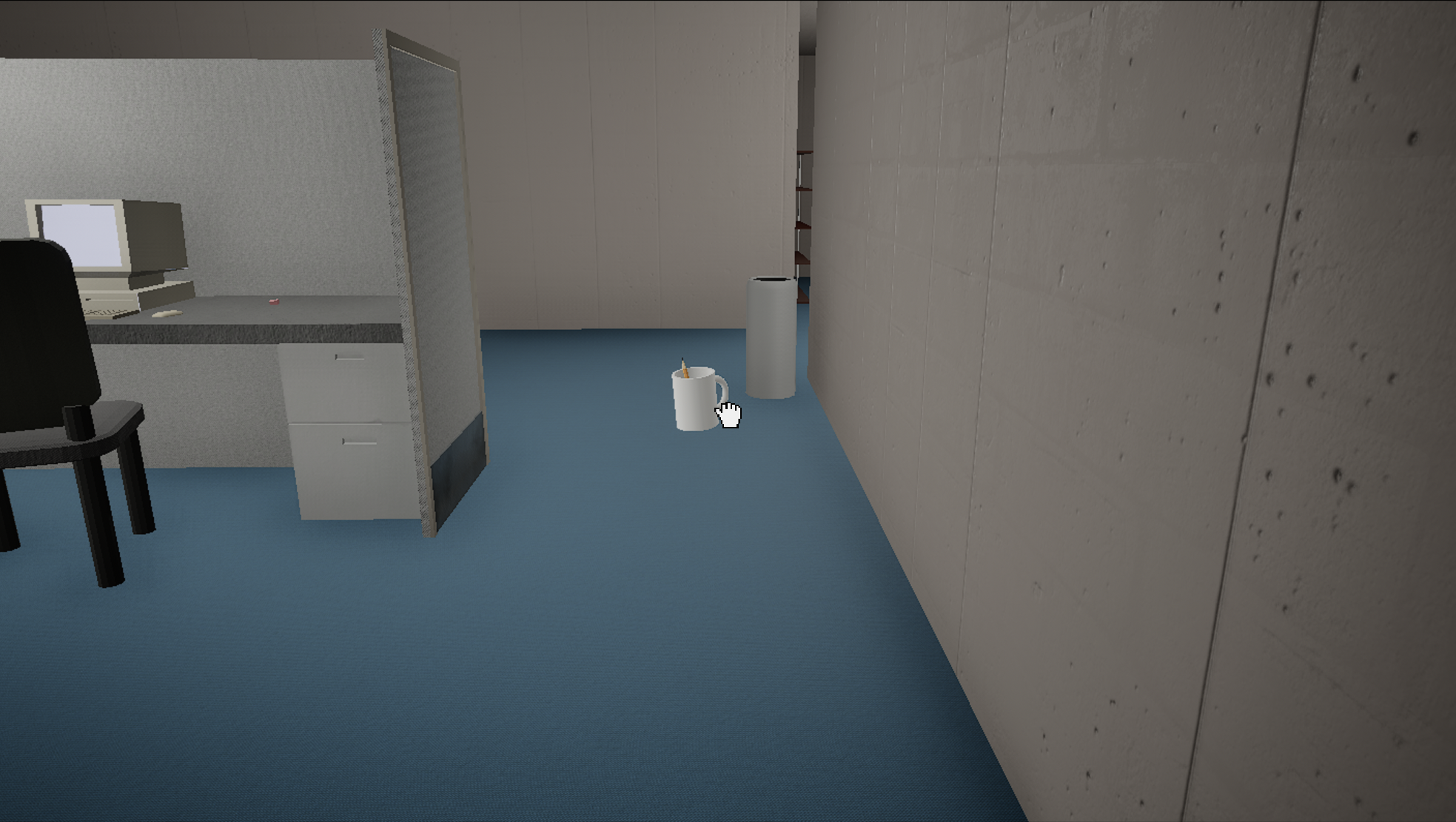
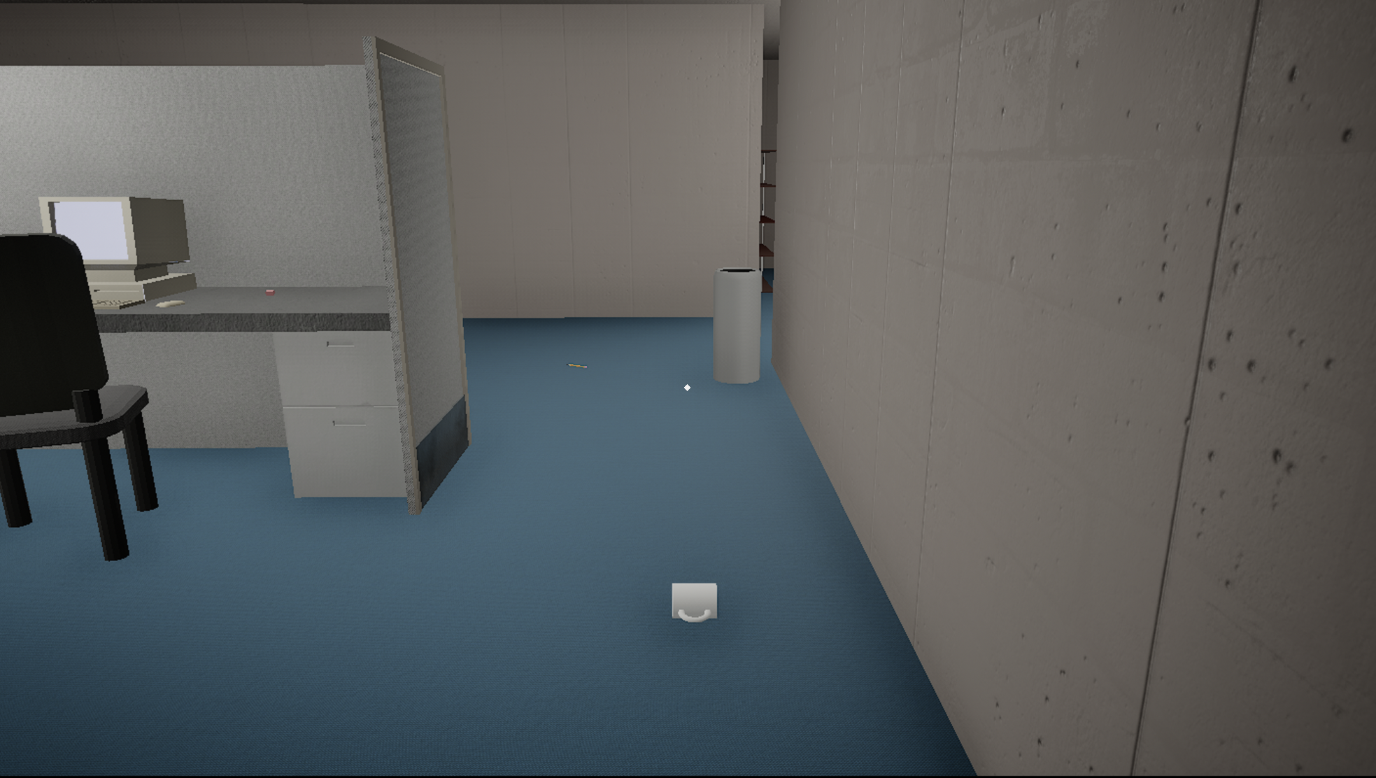
I also updated collisions to be more precise! I hope that pencil doesn't drop from my cup! If it did, it would probably roll really far away...

Look! You can see the game's new, precise collision allow you to put a mug through the basketball hoop, into the wastebasket!! Huzzah!!!
I worked on some systems that allow me to put files in our game for the player to find, as well as a system to have custom text on little plaque signs. I also have been trying to refine our game and figure out what details we will need to pull everything together.
MATH SEGMENT: Algebra and Functions
I hate fonts.
As I mentioned above, I set out to make a flexible system for signage in our game. I wanted to simply be able to insert some text and a font size, and have the sign plaque generate accordingly.
The problems arose because the font we are using for our signs is not monospace (and maybe it should be). Because some letters are significantly larger than others in the font (compare the capital 'M' and the lowercase 'i' for instance), you can't generate the size of the plaque just based on the number of characters in the sign's text.
This is annoying, because I either have to overcompensate and have a bunch of extra space on normal signage, or make the plaque not big enough when you use larger letters. I could theoretically look at the string and set the size based on the specific letters used, but that would be a huge pain.

Look out how that sign's text can barely stay inside the plaque holding it. points at sign

On the other hand, this sign has too much room above it!
My solution has been to pick a middle ground. You can see it in action above. The size of the sign plaque is determined by how many letters are used with an arbitrary (perhaps middle) length value added for each character in the text.
But it's actually more complicated, because I have the size change also based on font size.
When trying to make a formula to nicely calculate plaque sizes for changing fonts, I ran into additional problems because I have been struggling with understanding the precision of the math nodes in Unreal Engine's Blueprint code. While I could (and maybe should) further dig into Blueprint to understand exactly how values are rounded, I ended up decided that the signage was not worth it.

Some of the code I have been fighting to set the size of our signage plaques.
Because I have plenty to work on, I ended up high-balling the plaque size to make something good enough (as opposed to having text 'floating' off of the plaques) and move on with my life.
If you, dear reader, know an easy way to calculate the width of text that is not monospace, I would love to know. I have had similar challenges with CSS on this website, when I want to be able to fit arbitrary amounts of text in certain fractions of the screen.
Because I continually struggle with fitting text into spaces (or, in this case, fitting spaces around text), this problem annoys me close to my heart.
But sometimes there's bigger fish to fry. Still, it's interesting to fight with inconsistently sized text, and forces me to think about things I wouldn't in other settings.
MATH SEGMENT: Geometry
I have been continuing to adjust the layout of our levels and change the collision on different meshes. Rotating, scaling, and moving actors is becoming more and more automatic as I do it more and more.
I mentioned in the above MATH SEGMENT how I was trying to make a formula to determine an appropriate size for our plaque, and that too required me to make connections between our font size and the scaling applied to our plaque.
I still make use of attaching actors to a 'parent' to apply transformations to a group of actors.
In multiple cases I continued to manually set better collision on meshes. In some cases, I made the collisions less precise so that small items, like pencils and markers, are easier for our player to grab. Since those meshes so tiny, we have no need for fancier collision than a box anyway.
So on the geometry front, I have been continuing to practice my world editing skills, and using the techniques I been learning throughout the year.
I've also had trouble staying organized. Because some of our art assets are not sized exactly to simple numbers, I have to "fudge" actor locations in order to make all of our walls line up. This is annoying, but part of learning level design is learning to let go of perfection and perfect precision. Because at the end of the day, Unreal Engine subtley tweaks actor locations to try to correct actor placement over large distances anyway.
That's all for this MATH SEGMENT, sorry it's so skimpy!
And that's all for this blog post, thank you for reading. If you liked the increase in images, send me an email to the contact below! Thanks!
-Luke Knotts
